Scenography Themes
A collection of projects conducted in 2021 as part of the MAIA semester project THE IMPOSSIBLE SHOWROOM.
Monochrome < > Colourful
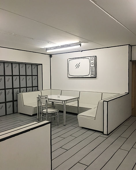
With just a color and simple drawn lines you can create a unique atmosphere.
Anti-Social bar in Leamington Spa, unknown designer.
Anti-Social bar in Leamington Spa, unknown designer.
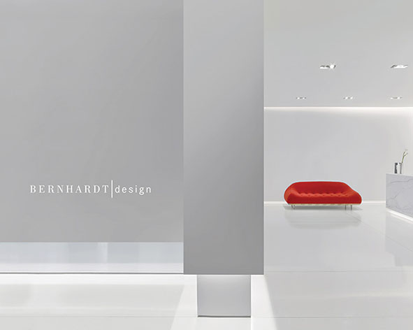
By designing a entirely white space you can easily put the focus on the object you are selling.
Bernhardt Design by Rottet Studio and One Lux Studio in New York City, 2017.
Bernhardt Design by Rottet Studio and One Lux Studio in New York City, 2017.

You can make a showroom attractive by using a monochrome color outside and inside.
Louis Vuitton showroom in New York by Virgil Abloh, 2019.
Louis Vuitton showroom in New York by Virgil Abloh, 2019.

Creating an atmosphere with only one color and a mirror effect.
Elena Lokastova, jewellery showroom in Moscow, 2021.
Elena Lokastova, jewellery showroom in Moscow, 2021.

Playing with color and unusual materialities can create an interesting,
intriguing, and interactive space.
Cafe in Russia, designed by Eduard Eremchuk and Katy Pititskaya, 2021.
Cafe in Russia, designed by Eduard Eremchuk and Katy Pititskaya, 2021.
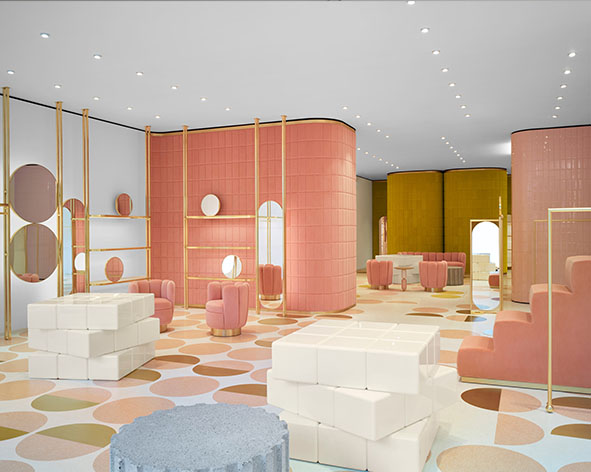
A great example of how to coordinate color palette, furniture and brand identity.
India Mahdavi first RED Valentino store in London, 2016.
India Mahdavi first RED Valentino store in London, 2016.
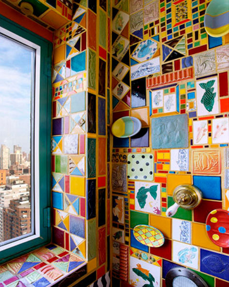
A collage full of colors and multiple diverse patterns can almost result in a homogenic unity.
Upper East Side ( New York) home of artist Apryl Miller, 2021.
Upper East Side ( New York) home of artist Apryl Miller, 2021.

Strips of colored lights can be used to add color and simultaneously divide spaces.
Robert Storey Studio for Nike presentation space in New York, 2014.
Robert Storey Studio for Nike presentation space in New York, 2014.
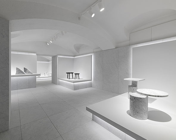
Monochrome spaces can also be created with one or different materialities, according to a brand.
Studio Nendo for Marsotto showroom in Milan, Italy, 2020.
Studio Nendo for Marsotto showroom in Milan, Italy, 2020.

An elegant cohesion of tones and materials form a calm elegance, inviting clients to freely engage and browse the displayed products, while enjoying the characteristic setting at the same time.
Dimore studio for AESOP shop in Milano, Italy, 2015.
Dimore studio for AESOP shop in Milano, Italy, 2015.
Large Space < > Chambers
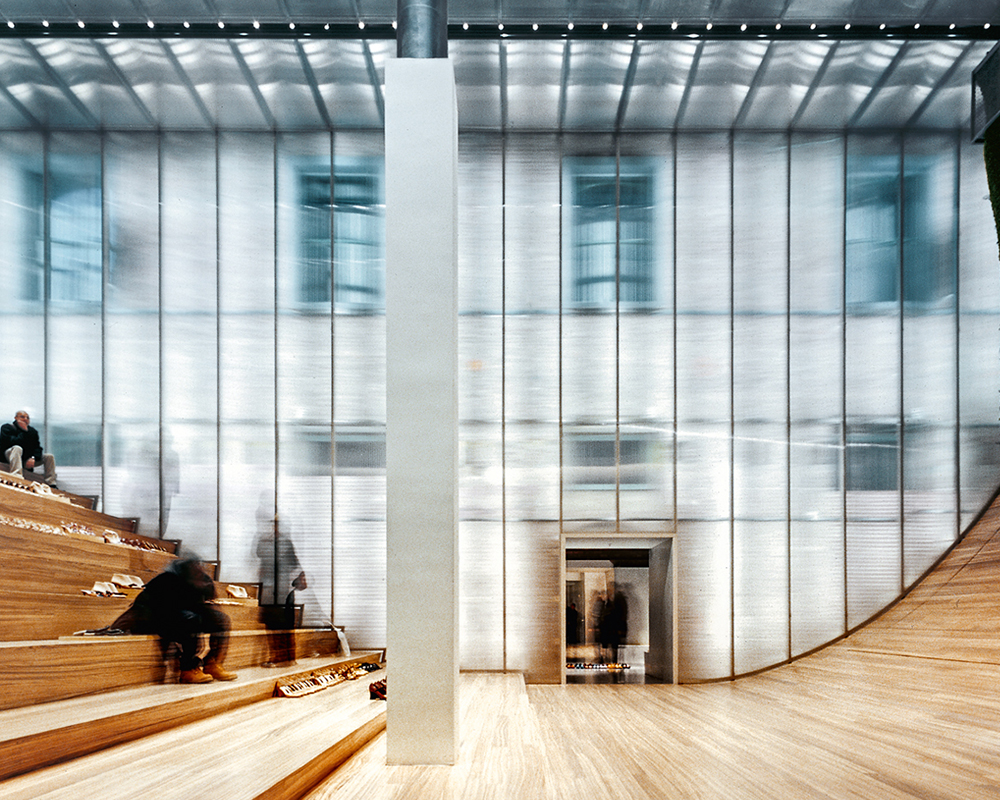
Big empty space that lost a few things exposed with a scale contradiction.
Prada New-York 2001
Prada New-York 2001

A very large space quite empty, which contrast with the human scale.
B&B Milano Showroom 2021
B&B Milano Showroom 2021

Large white space with furniture exposed on a simple rack to give a museum-like feeling.
Vitra Schaudepot 2016
Vitra Schaudepot 2016

Simplicity in the layout, pieces of cloths are the only elements that create the space.
Danish Design in Shanghaï by Gam Fratesi 2013
Danish Design in Shanghaï by Gam Fratesi 2013
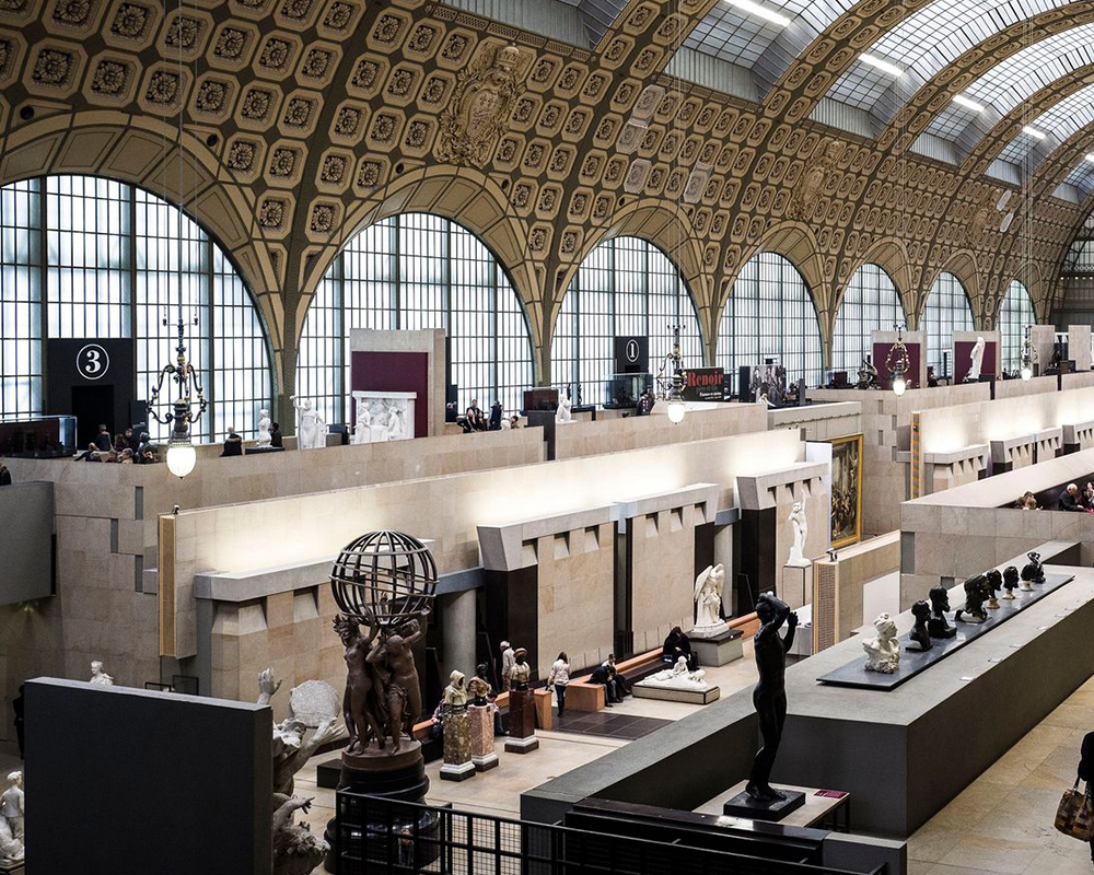
Redefined space by adding physical and visual limits to precise a large area into smaller
ones.
Musée d’Orsay in Paris, 2019
Musée d’Orsay in Paris, 2019

Little chambers open on a big central space creates an overview, which gives a panoramic
view on products.
Nilufar Depot Design week 2015
Nilufar Depot Design week 2015
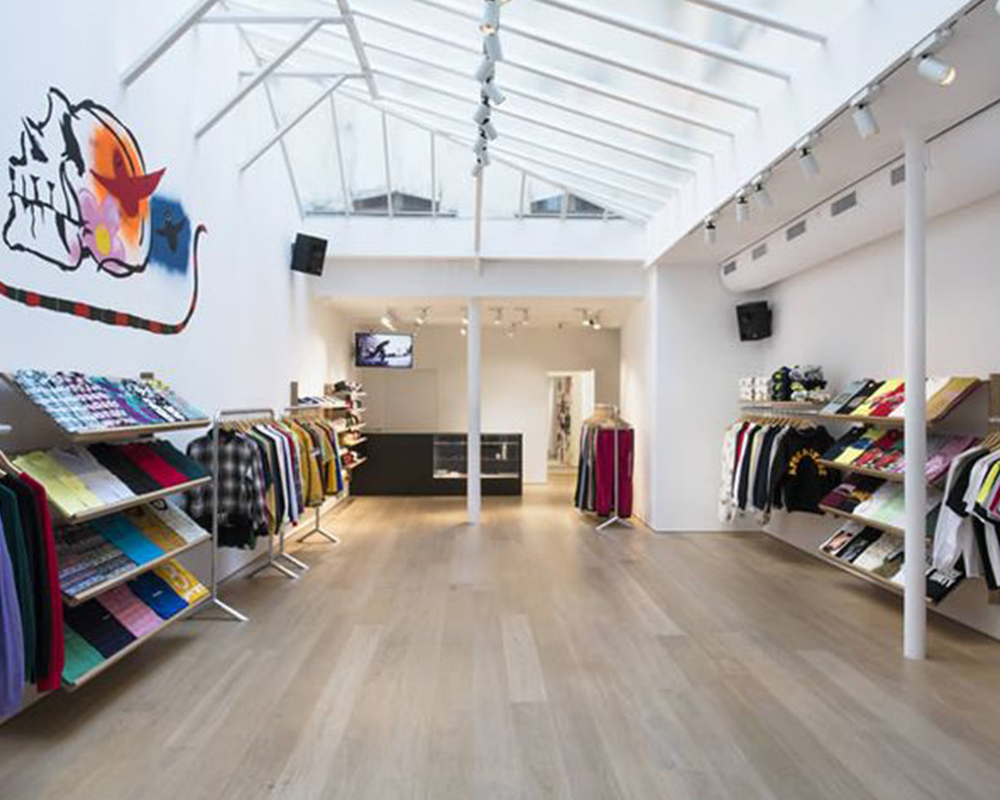
Medium space allows exposure of products, giving highlight on each product inside the
space.
Supreme Paris by Brinkworth 2016
Supreme Paris by Brinkworth 2016
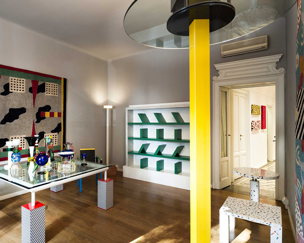
Multiple chambers create a journey inside a larger space
Memphis Gallery 2020
Memphis Gallery 2020
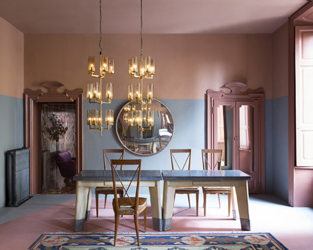
A lot of little rooms allow to have defined areas and creating a homely feeling.
Dimore Gallery, Milano, 2018
Dimore Gallery, Milano, 2018
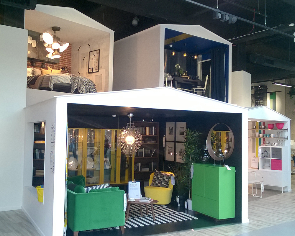
Little different spaces allow the change of perception and feel, which create contrast
between the pieces.
Ikea Stratford 2019
Ikea Stratford 2019
White Cube < > Immersive Space

In a very neutral way, the white cube highlights the work of art.
Daniel Turner, Inside the white cube, White Cube Bermondsey, 2012
Daniel Turner, Inside the white cube, White Cube Bermondsey, 2012
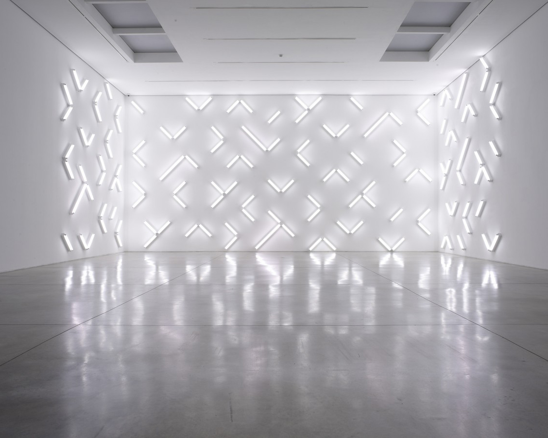
The artwork uses the surfaces of the white cube and plays with them.
Robert Irwin, White Cube Masonís Yard, 2008
Robert Irwin, White Cube Masonís Yard, 2008

A set of perspectives and monochrome allows to highlight the variety of objects.
Nendo, Marsotto Milan Showroom, 2020
Nendo, Marsotto Milan Showroom, 2020
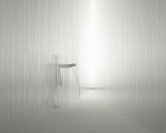
Using one material to create a sensitive experience of the space.
Tokujin Yoshioka x Lexus L-finesse,Moco Loco, Milan, 2014
Tokujin Yoshioka x Lexus L-finesse,Moco Loco, Milan, 2014
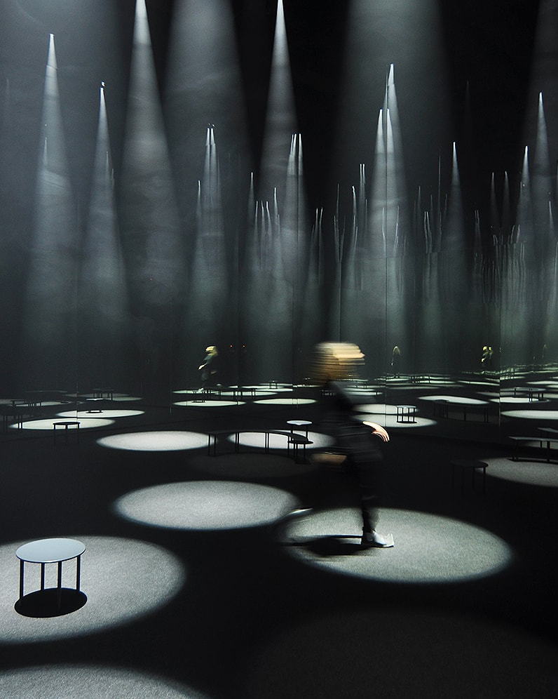
Light becomes an interface as a form of architecture to display objects and create circulation.
Sou Fujimoto, Forest of life for COS, Salone del mobile, 2016
Sou Fujimoto, Forest of life for COS, Salone del mobile, 2016
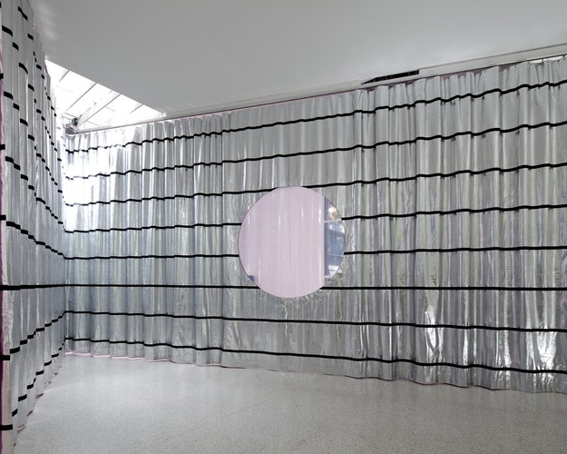
Using one material to define an ilusion of the space.
Petra Blaisse, Dutch pavilion, Architecture biennale, venice, 2012
Petra Blaisse, Dutch pavilion, Architecture biennale, venice, 2012

The repetition of an element creates an immersive experience.
Jesús Rafael Soto, Pénétrable BBL bleu, Fondation Louis Vuitton, 1999
Jesús Rafael Soto, Pénétrable BBL bleu, Fondation Louis Vuitton, 1999

Using light to give it a material and contemplative quality.
James Turrell, Aten Reign, Guggenheim New-York , 2013
James Turrell, Aten Reign, Guggenheim New-York , 2013
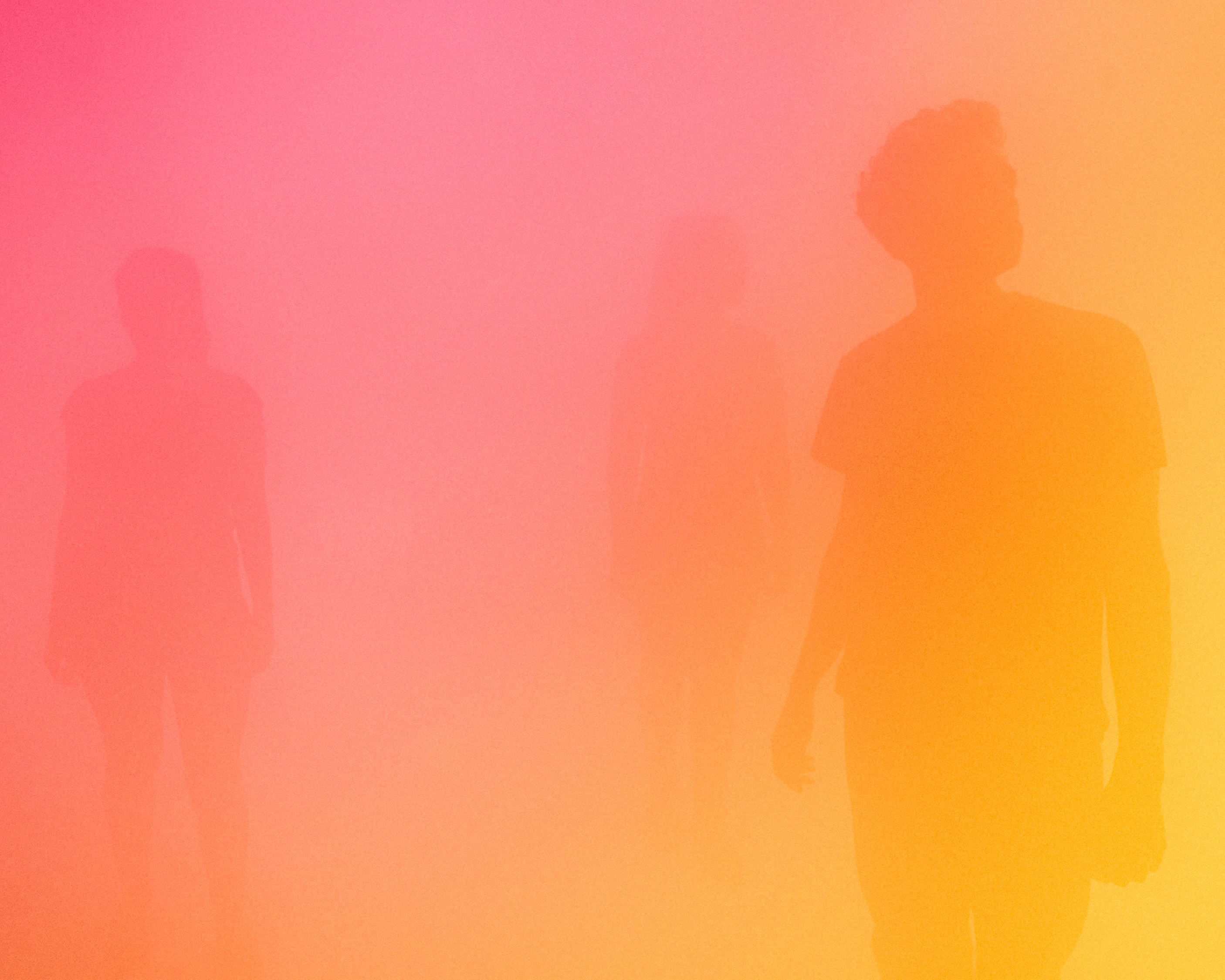
Exploring light and colour to blur the boundaries of surface and depth.
Ann Veronica Janssens, Jaune Bleu Rose, 2015
Ann Veronica Janssens, Jaune Bleu Rose, 2015
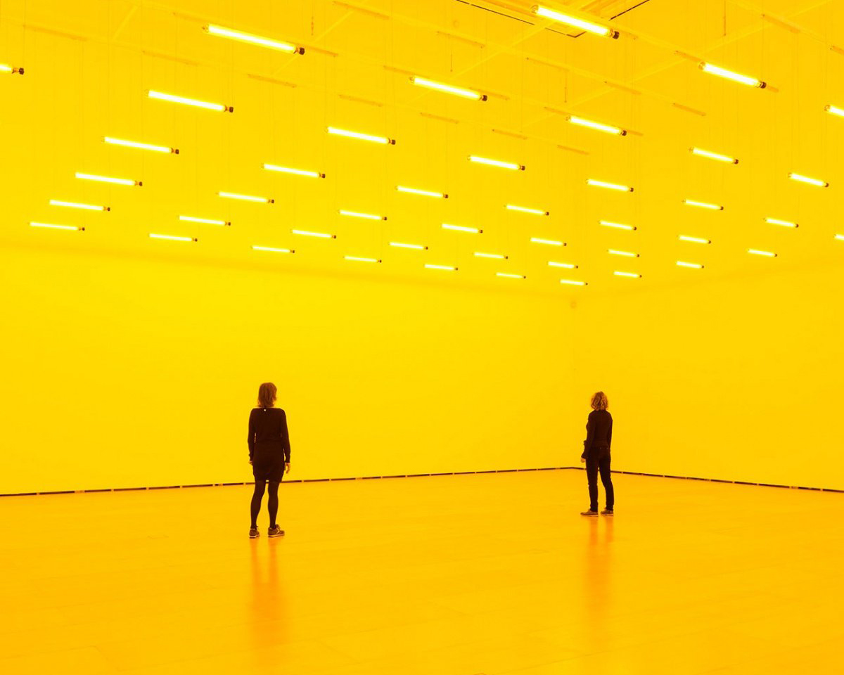
Using light to transform the perception of the visitor.
Olafur Eliasson, Room for one color, Guggenheim Bilbao, 1997
Olafur Eliasson, Room for one color, Guggenheim Bilbao, 1997
Neutral < > Emotional
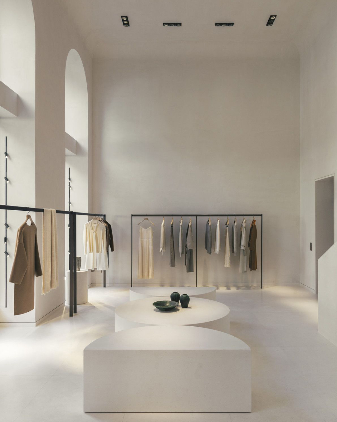
very minimalist and neutral to put emphasis on the products
Bernard Dubois for Icicle
Bernard Dubois for Icicle

space almost completely white to neutralize the architecture elements in order to let the products stand out
Federicia Showroom in Copenhagen
Federicia Showroom in Copenhagen
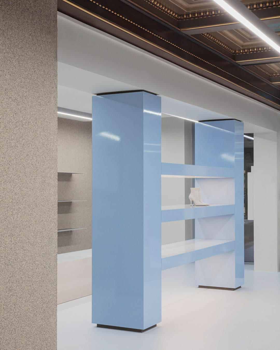
neutral space with some pale coloured elements
David Thulstrup for Collage The Shop
David Thulstrup for Collage The Shop
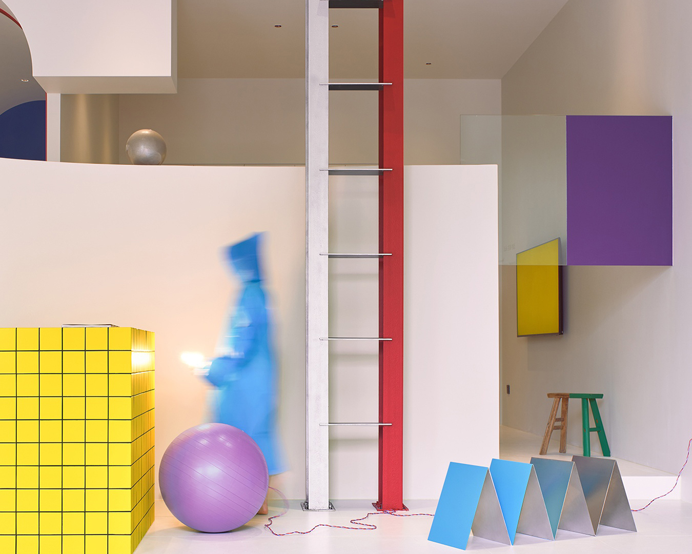
white neutral cube with coloured patterned objects
NDB Design Studio for Benjamin Moore
NDB Design Studio for Benjamin Moore

although the space might seem neutral because of the white color, the plasticity of the elements resemble a world of ice and therefore creates emotions
Snarkitecture for Richard Chai
Snarkitecture for Richard Chai
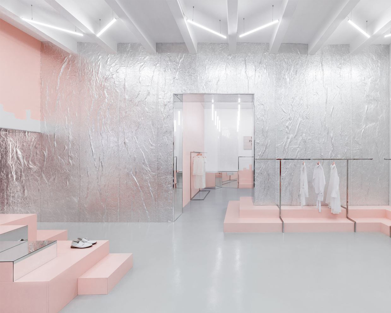
the spatial and display elements being quite minimal, the use of color and materials make the shop look quite emotional
AKZ Architectura for Blushhh! Secret Shop
AKZ Architectura for Blushhh! Secret Shop
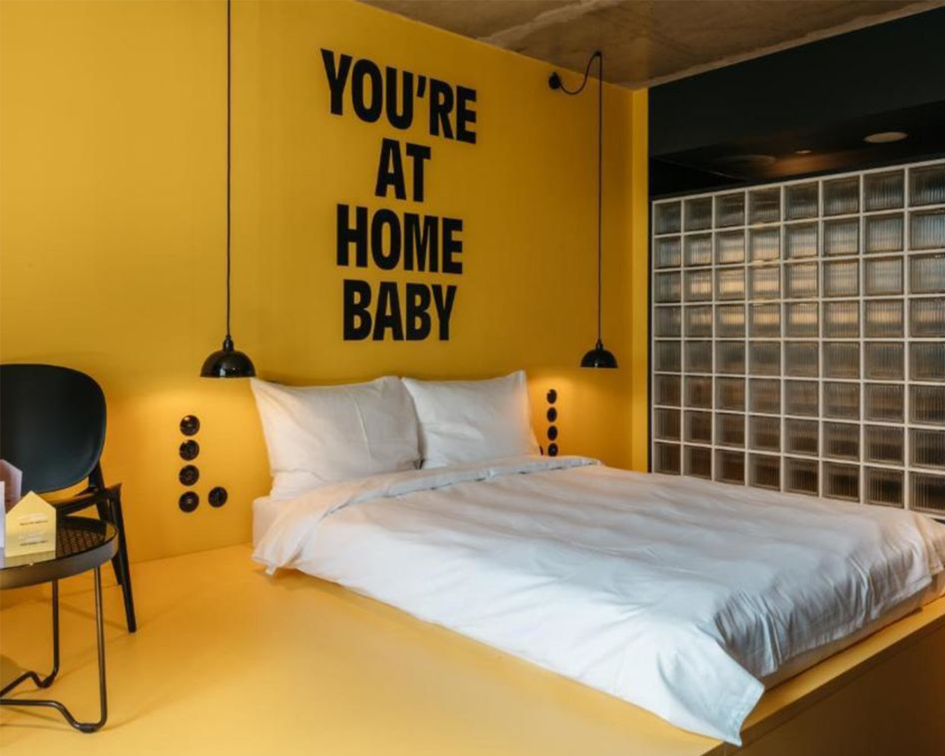
the combination of yellow paint and the right font, could make a simple hotel room feel like actually living Radio FM4
Atelier Karasinski for Superbude Hotel
Atelier Karasinski for Superbude Hotel

playing with different materials, textures and bright colors can make a space emotional
Christopher Elliott Studio for EST Lighting
Christopher Elliott Studio for EST Lighting
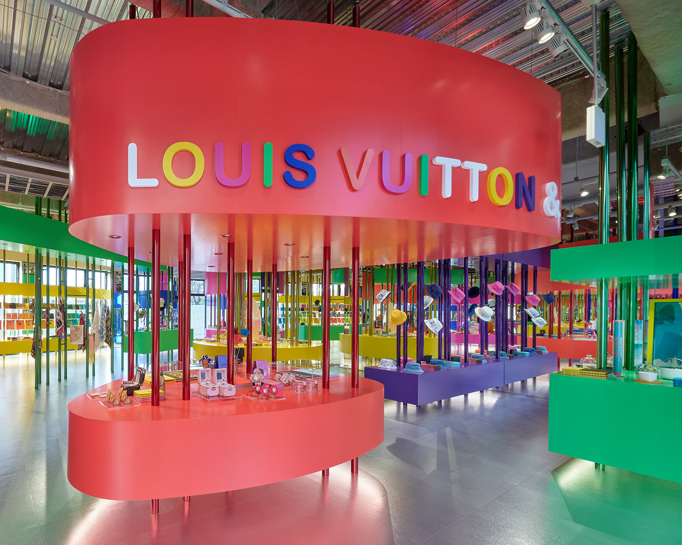
use of color in display elements make the space feel emotional, especially due to the high contratst between the architecture and the scenography
Sugawaradaisuke Architects for Louis Vuitton
Sugawaradaisuke Architects for Louis Vuitton
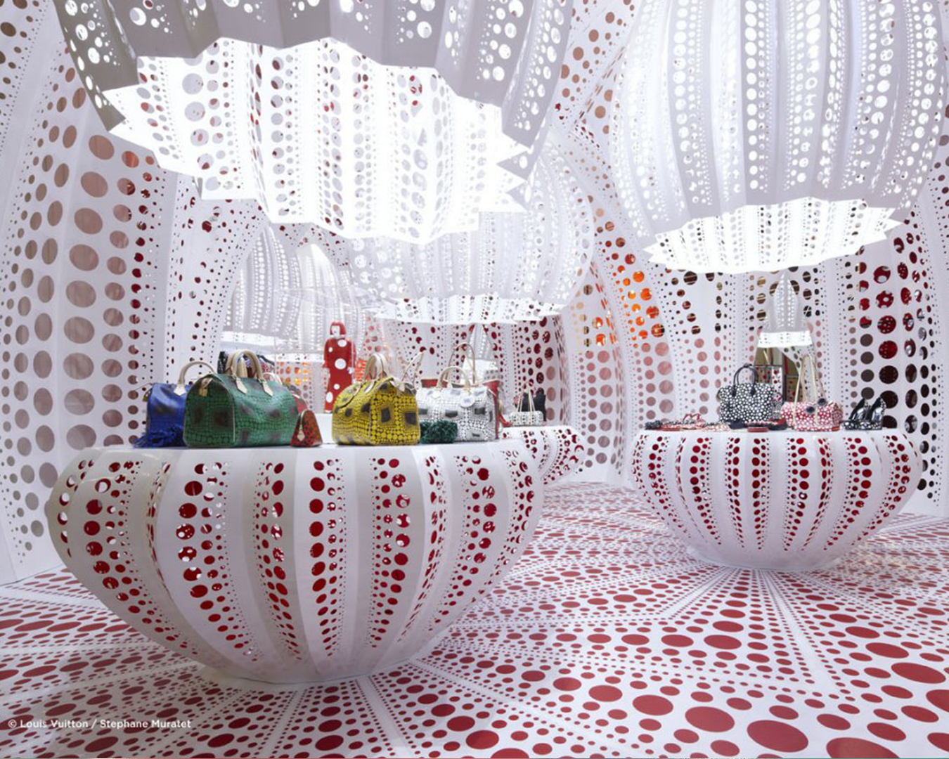
playing with form, color and patterns makes the space feel very emotional
Yayoi Kusama for Louis Vuitton
Yayoi Kusama for Louis Vuitton
Introduction | Editorial | References | Projects | Research
HEAD – Genève | Interior Architecture | Atelier Simon Husslein | Copyright © 2025